Colorado Health Foundation Review
Overview
The foundation’s website as it stands:
- Fails HTML validation (see here)
- Lacks mobile design (see here)
- Poor website optimization (see here)
- Average readability (see here)
- Duplicate content across multiple pages (see below)
- Small viewing area for main content (see below)
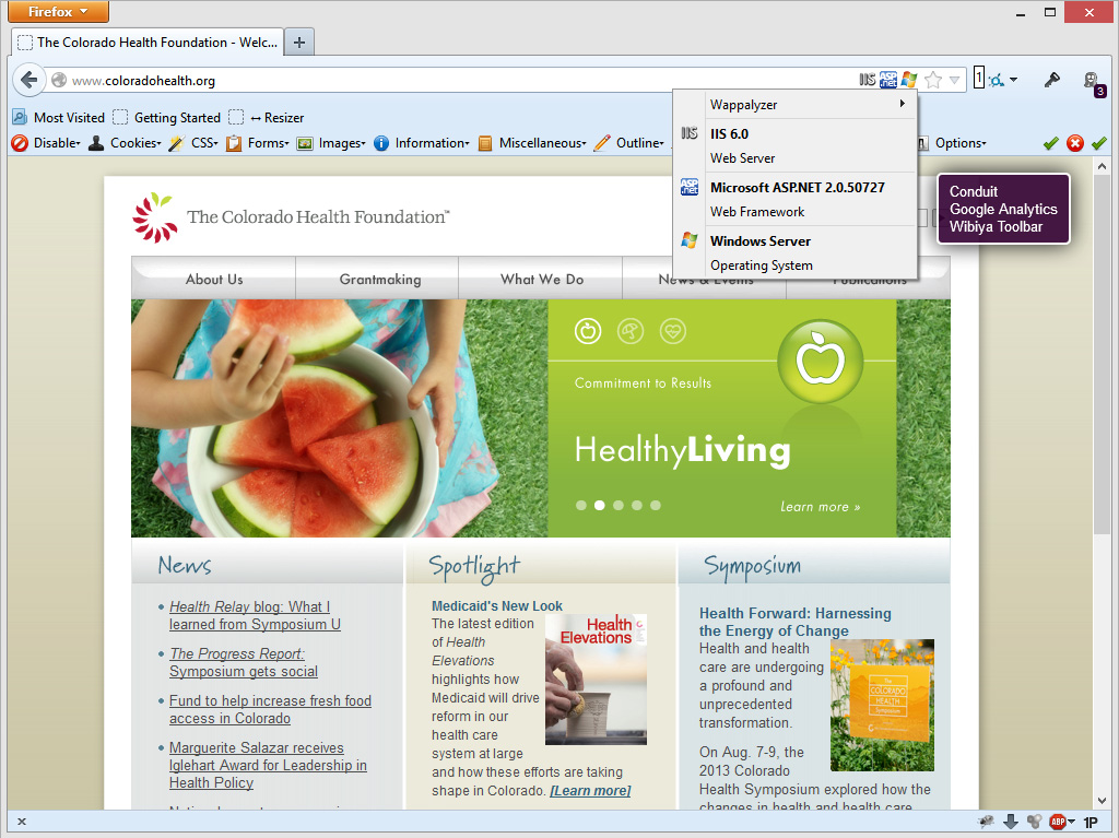
- Runs on older technology (see here)
Website – Home
The current home page lacks optimization for speed, SEO, and readability engagement. The dimensions of the sliders and visual images needs to be larger so as to provide a clearer separation of text and visual cues.
The homepage has a duplicate URL due to /default.aspx. A duplicate URL results in misleading analytics, lower search rankings, and potential broken bookmarks.
Dimensions:
- Site width – 841px
- Header – 750px
- Content width – 750px
- Content slider – 750 x 218px
- Footer – 841px
I would recommend switching to a responsive design that widens the viewing area for desktops and optimize the viewing experience for mobile devices and tablets. It results in better readability and therefore higher engagement.
			p{
				color: #4C4C4C;
				font-family: Arial,Helvetica,sans-serif;
				font-size: 13px;
				font-weight: normal;
				line-height: 18px;
			}

			h1 {
				color: #31627B !important;
				font-family: Arial,Helvetica,sans-serif;
				font-size: 14px !important;
				line-height: 17px;
				font-weight: bold;
				margin-bottom: 5px;
			}
Arial is fine for readability, but a different typography would add more value to the overall design while still retaining readability. The current heading text and paragraph text are too similar in size, and the header text has a lower line-height.
SEO:
I would estimate that the foundation is doing well with sites linking in but poorly with regards to original content and website architecture.
The blog is hosted on an entirely different domain (http://coloradohealth.typepad.com). It would increase search engine ranking and relevancy to move the blog to the primary domain.
The architecture problem is due to poor coding practices as is evidenced by:
			<title>The Colorado Health Foundation - Welcome</title>
			<meta name="keywords" content="health foundation" />
			<meta name="description" content="SpotLight features." />
			<title>The Colorado Health Foundation</title>
			<meta name="keywords" content="health, colorado health, health insurance, grants, healthy living, health coverage, health care, health foundation" />
			<meta name="description" content="Together, we will make Colorado the healthiest state in the nation." />
Slider:
			$(document).ready(function(){
				$('.hero ul li:first-child').addClass('first-child');
				$('.hero ul').cycle({
				fx: 'fade',
				pager: '#nav',
				after: onAfter
				});
				function onAfter() {
				/*console.log($(this));*/
				if($(this).is('.first-child')){
				$('.top-line').animate({height:'46px'}, 1000);
				$('.bottom-line').animate({height:'92px'}, 1000);
				}else{
				$('.top-line').css({'height':'1px', 'bottom':'157px'});
				$('.bottom-line').css({'height':'1px', 'top':'108px'});
				}
				}
				$('#nav a:last-child').addClass('last-child');
			});
The slider content measures 750x218px which is quite small. Additionally, the slider CSS and JS files are loaded separately rather than minify and combine with the global javascript and CSS files to reduce request calls.
Website – About Us
- URLs
- About Us – http://www.coloradohealth.org/about.aspx
- About Us Overview – http://www.coloradohealth.org/landing.aspx?id=132
- Mission and Values – http://www.coloradohealth.org/mission.aspx
- Our Story – http://www.coloradohealth.org/ourstory.aspx
The About page is one of the most frequently visited pages for new users. It is better to consolidate the content on these pages into one main page and simplify the content for better user engagement.
The duplicate content especially for the About Us and the About Us – Overview page greatly lowers search engine ranking.
Dimensions: About Us
- Site width – 841px
- Header – 750px
- Left Menu – 187px;
- Content Area – 331px
- Right Sidebar – 156px
- Footer – 841px
The current content area being 331px is smaller than the recommended 600px to 700px. A viewing area that is either too large or too small lowers usability and engagement.
Conclusion
Vision: Colorado will become the healthiest state in the nation.
Mission: To improve the health and health care of Coloradans by increasing access to quality health care and encouraging healthy lifestyle choices.
Does the foundation’s digital message match its core values? And does the message reach the target audience?
We live in a world where it is easier than ever to reach the audience, but it is extremely difficult to engage them. If you make consuming content too difficult, you will lose your average user. So, how do we ensure that we succesfully convey our message?
We make it easy. We make it simple. We make it so that it just works.
It is an extremely ardous task to take something complicated and sieve it down to simple elegance, but we can start by fixing and optimizing the website and its integration with social media outlets. We measure the analytics over the course of time to see what works and what doesn’t. We take away the excess and simplify every piece of content (writing, photos, videos) so that our story and values align with our visitor’s values and daily lives.
Photos


